Struggling with blurry website imagery? You’re not alone. Here’s how to optimize for better image clarity across different browsers.
When it comes to your website, visual content plays a huge role. In a world where it takes our brains only 13 milliseconds to process an image – visuals help narrate your brand story in a quick and visually captivating way.
This ability to process images so quickly places even more importance on the need for crisp high-quality content. A website tainted with fuzzy and blurry images can affect engagement and lead to an overall negative experience for visitors.
In today’s world, exporting and uploading images is no simple task. You must consider retina screens, how different browsers downscale images, and how content will look on different screen sizes.
During Uptime.com’s rebrand, we utilized best practices to ensure website visitors are seeing your pages clearly – regardless of the browser or screen size – that we’re excited to share with you.
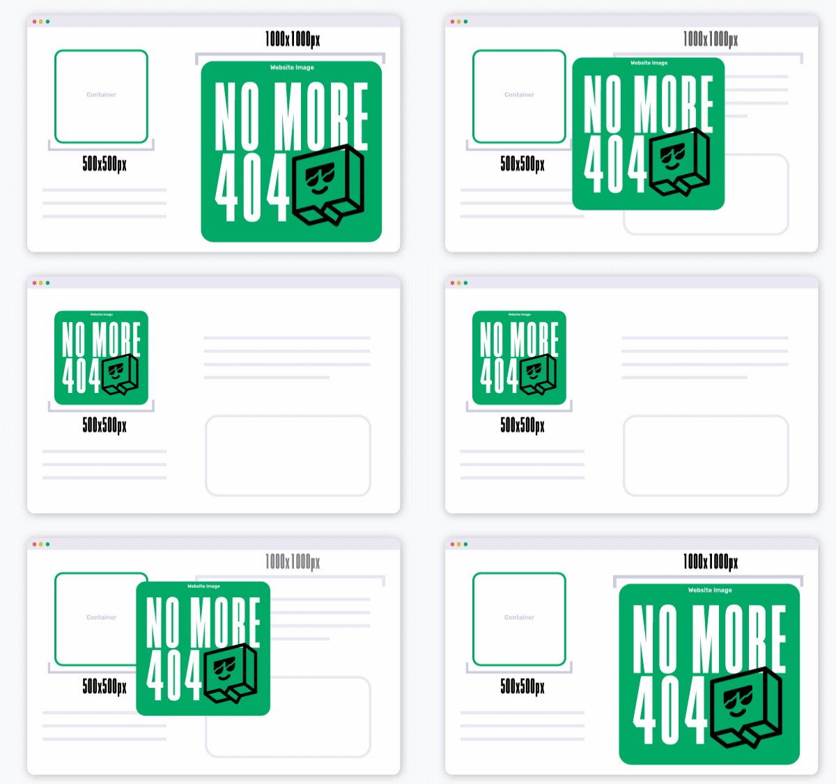
Export image assets at 2x the container size of your web page layout
Exporting your web assets at 2x (200%) is a great way to add clarity to website images. In doing so, you are creating more pixel density and allowing those pixels to be dispersed based on the size your viewer’s screen is displaying the image. Bigger screen = bigger picture.

Images that are 2x the container size also helps with image responsiveness. Based on the screen size someone is viewing your imagery on, the image can adapt accordingly. With twice as many pixels as the original, your photos will remain crisp even when scaled larger or displayed on a retina screen.
![]()
Export images as whole numbers and when divided by two, make sure it remains a whole number
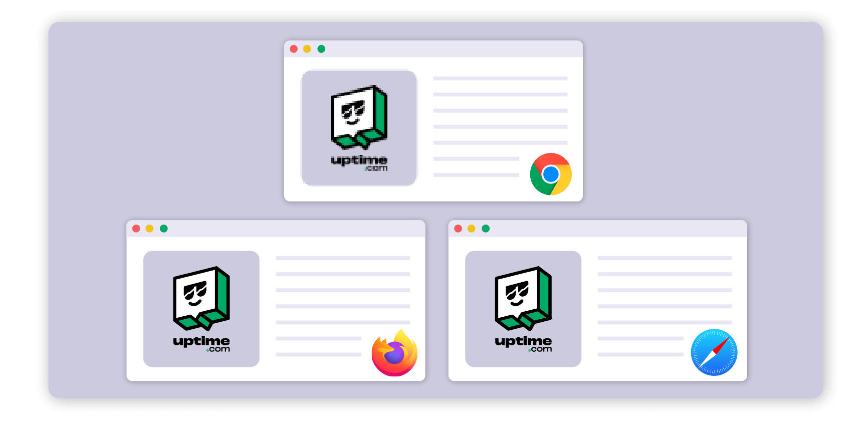
This was the most unexpected discovery in our journey to deliver clear imagery across our new site. We found that our images were rendering clearly on browsers such as Safari and Firefox, but when viewed in Chrome the images were not as clear as our original uploads. However, when the image was opened in a separate tab or downloaded, the image was clear and the resolution was crisp again.
 We concluded that the issue was coming from a downscaling issue on Chrome, which was solved by exporting our images in whole numbers and ensuring that when divided by two, they were still whole numbers. Pixel distortion occurred when Chrome had to downscale an image that contained a decimal, essentially splitting pixels which resulted in a jagged and fuzzy image.
Hopefully these tips help you better optimize your images for all browser audiences. After uploading your website images, review on a variety of browsers and screen resolutions for any downscaling inconsistencies.
After all, a picture is worth a thousand words, but a blurry one is worth far less.
Minute-by-minute Uptime checks.
Start your 14-day free trial with no credit card required at Uptime.com.
 Uptime.com Blog


