10 Best Examples of Branded Website Status Pages
What is a Status Page? Status pages are a valuable asset for any website or SaaS business – especially today when outages and downtime have never been more common and uptime expectations have never been higher.
Status Pages are an essential component of a website monitoring strategy because they provide users with a centralized location to check the status of a website or application.
Whether your site or app is down or all systems are perfectly operational, hosted status pages provide external users and internal stakeholders with a single source of truth regarding uptime performance.
When done well, status pages are elegant and custom-branded. They should look and feel like they’re part of a businesses’ family of web pages — because they are.
Status Pages won’t be referenced in the same way a marketing website is, nor will they engage subscribers as frequently as social media accounts do. That said — they offer customers, employees, partners, and management with a transparent look into current and historical website or application performance that could make (or break) trust.
Here are some of our favorite website status pages from a variety of different industries.
Shopify
System Status Page: Here
Industry: Software as a Service (SaaS) for Ecommerce
Who it’s for: Shopify platform’s powers the online stores of 1+ million e-commerce brands and integrates with hundreds of other SaaS tools. Altogether, it’s no stretch to say Shopify’s ecosystem reaches tens of millions of B2C and B2B consumers everyday.
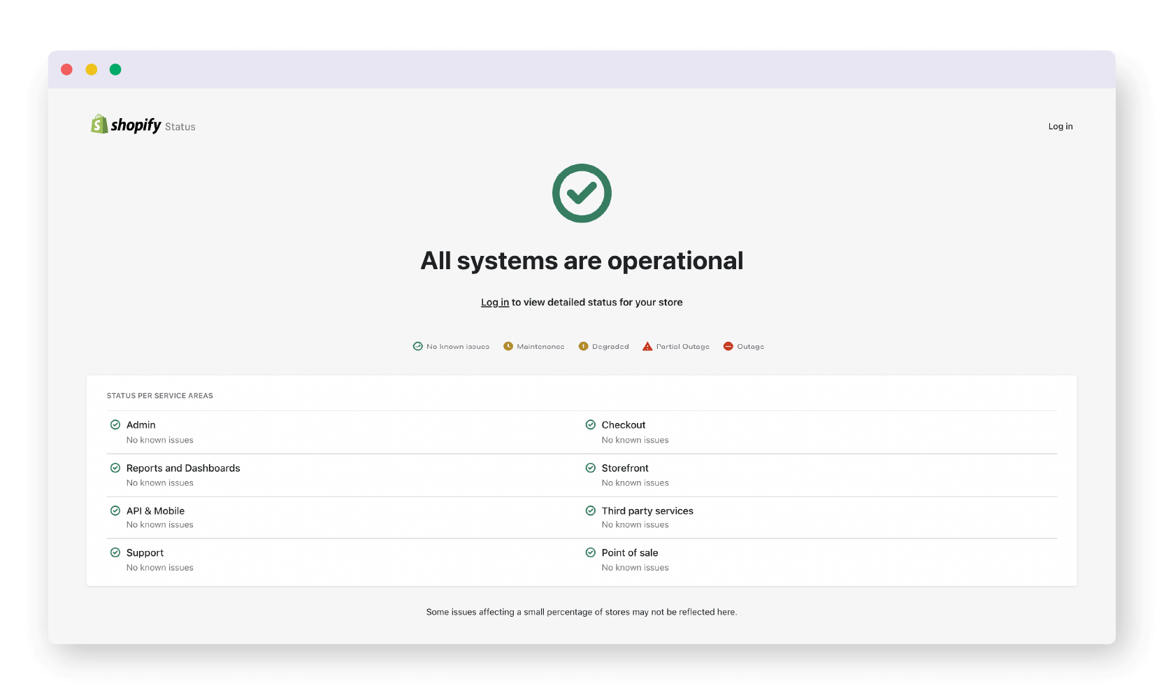
What we love: Shopify is known for their approachable branding, and they incorporate that into their use of custom icons representing various system statuses to offer visitors a clear and elegant way to understand overall system performance.
Slack
System Status Page: Here
Industry: Software as a Service (SaaS) for Business Communication
Who it’s for: Slack has taken the business world by storm. 10 million people use Slack everyday and spend an average of 9 hours in the tool per day – wow! This extremely high usage paired with the critical role it plays in remote work and collaboration means there will be many eager eyes on this status page during an outage.
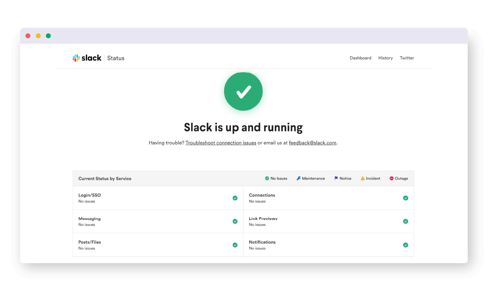
What we love: The bold, clear and simple green check at the top of the page offers the audience quick indication of system operations. Slack going down will inherently be a stressful time for users – using iconography and easy to understand information will help ease this stress.
Apple
System Status Page: Here
Industry: B2B and B2C Hardware and Software.
Who it’s for: Apple is known for their many hardware and software products and dedicated user base. Much like their products, their nearly 600 million users vary from tech savvy to casual iPhone users. As a result, this page could be seen by hundreds of millions of visitors.
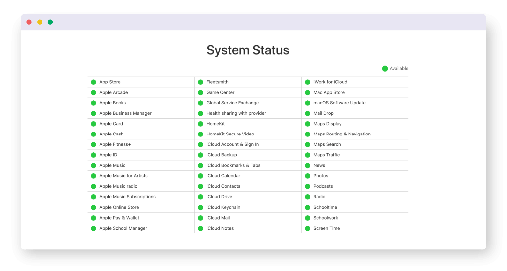
What we love: This page simplifies an otherwise complex infrastructure and the sheer quantity of systems they are reporting on with a streamlined, clear format and color scheme. Apple has applied the elegant and simple design aesthetics they’re known for to their status page.
Rediker
System Status Page: Here
Industry: Software as a Service (SaaS) for School Management
Who it’s for: This is a management tool for schools, so the users visiting the page will be teachers, administrators, and even parents. Rediker is widely used, and can be found in 115 countries worldwide – including all 50 US states. This requires a polished, elegant page that is easily read and referenced by a wide audience.
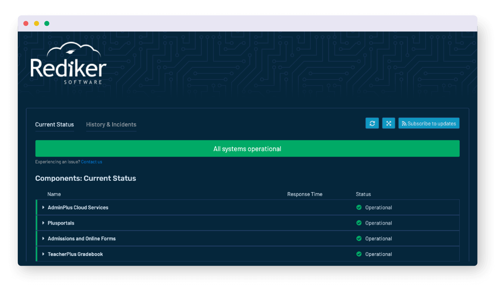
What we love: This page has been fully branded with custom html and CSS to align with other company content, from the logo to the background colors. It also allows the audience to make a quick inference about current operations and recent history/incidents. There is a high dependence on education software to be up and running so a status page reporting on systems is crucial.
Zendesk
System Status Page: Here
Industry: Software as a Service (SaaS) for B2B Support
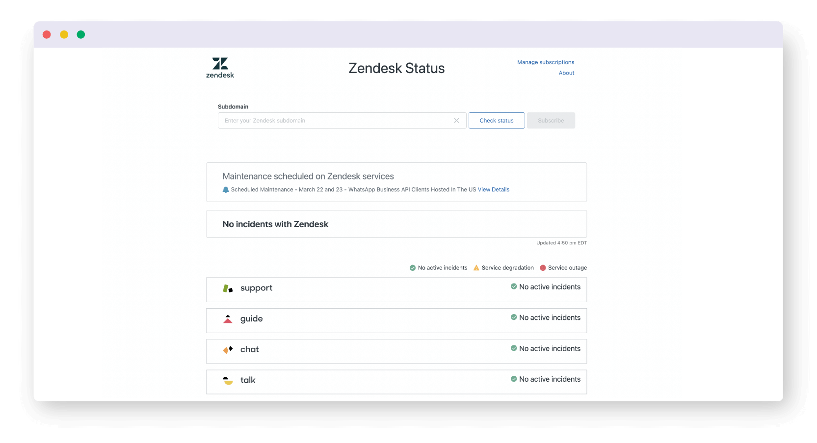
Who it’s for: Zendesk’s software is used by an incredible 40,000 technical customer support professionals, including Uptime.com! These users in-turn leverage Zendesk to support 300 million people worldwide. This means considerable eyes and traffic on the company’s status page if downtime were to strike.
What we love: Zendesk status page’s polished branding and iconography makes for an attractive and cohesive page. We also love the clear call-outs for scheduled maintenance windows. If clarity is key to an excellent status page, it’s clear to us that Zendesk’s status page is an effective one.
Stark Bank
System Status Page: Here
Industry: Banking and Financial Services for B2B Enterprises
Who it’s for: Stark Bank considers themselves the first digital bank for enterprise accounts. When we consider the importance of immediacy, accuracy, and transparency in financial services, it’s no wonder why they invested in a quality website status page for customers to reference.
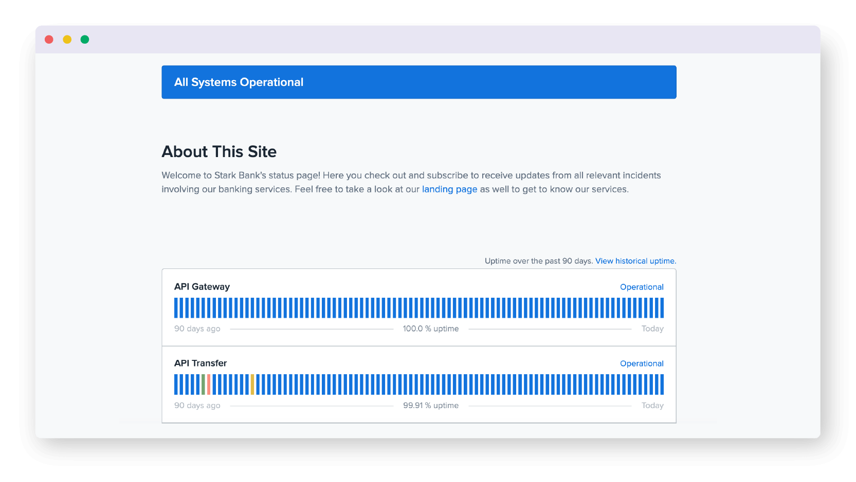
What we love: Stark Bank’s excellent use of color makes it easy to understand if and where issues arise, and the uptime SLA is clearly stated. This makes for a universally understandable page to provide their enterprise customers peace of mind.
Buzzfeed
System Status Page: Here
Industry: News, Media, and Entertainment Website
Who it’s for: Buzzfeed has built a dedicated audience of Millenial and Gen-Z readers through a unique mix of fun quizzes and in-depth reporting. More than 130 million monthly readers visit Buzzfeed, and their content can reach up to 3.2 billion impressions – WOW! Such a heavily engaged website needs an equally strong status page to communicate downtime and maintenance to readers.
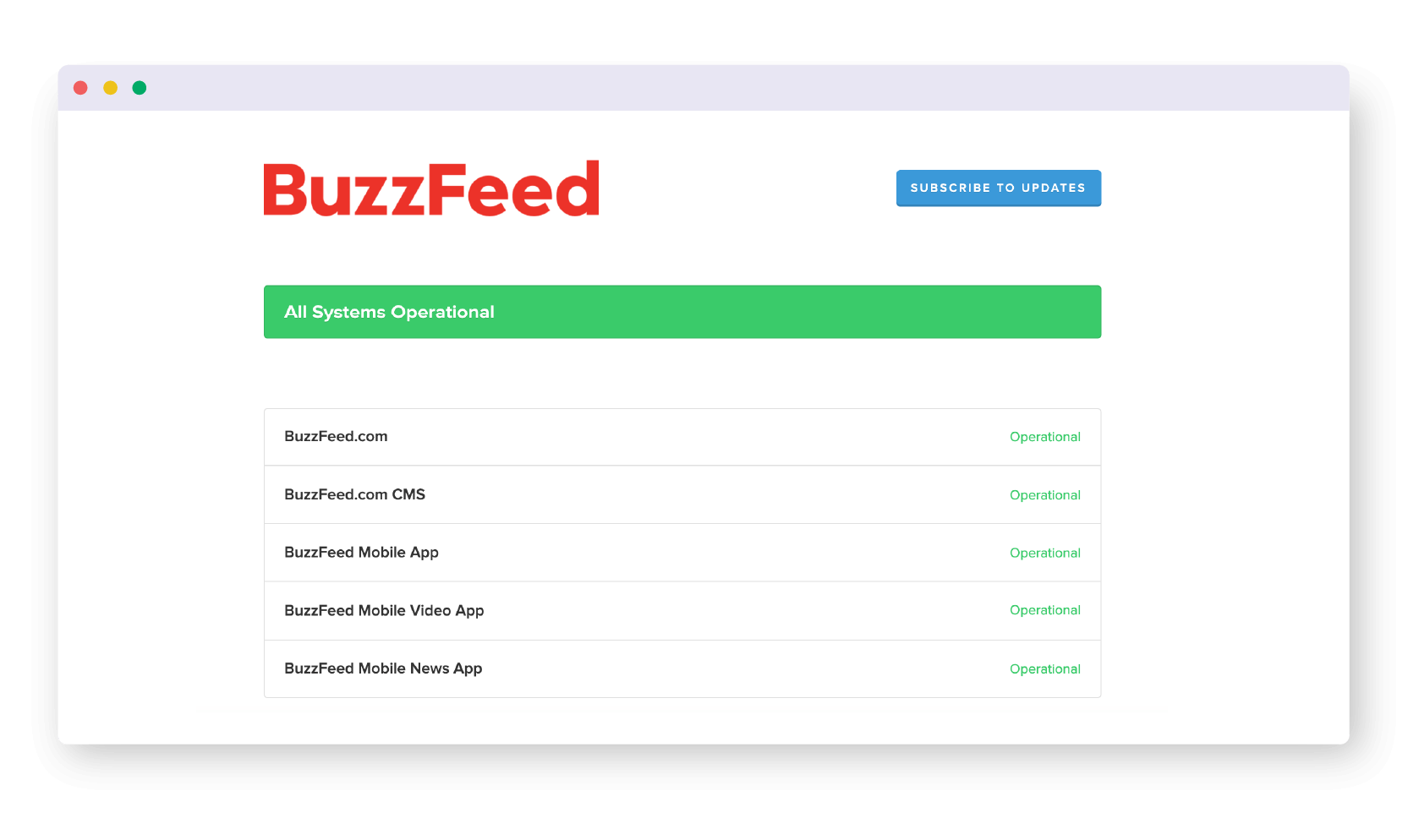
What we love: Much like Buzzfeed’s content and brand, their status page is simple and easy to digest. The prominent subscribe button is perfect for attracting Buzzfeed’s most dedicated readers who want moment-it-happens alerts should downtime strike.
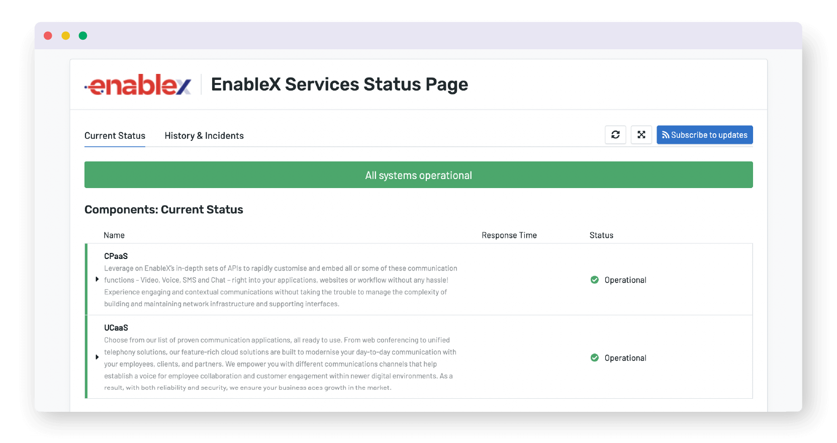
Enablex.io
System Status Page: Here
Industry: Software as a Service (SaaS) for Business Video Call and Chat
Who it’s for: This software is leveraged by businesses to engage their audiences and is heavily reliant on APIs and integrations. This means their users will be paying close attention to whether all endpoints are 200 OK.
What we love: Enablex.io’s status page focuses more on the different components making up Enablex.io’s infrastructure, offering clarity on what exactly is being monitored. The inclusion of current status, along with history and incidents makes for a comprehensive view into system operations.
University of Nebraska
System Status Page: Here
Industry: University, Higher Education
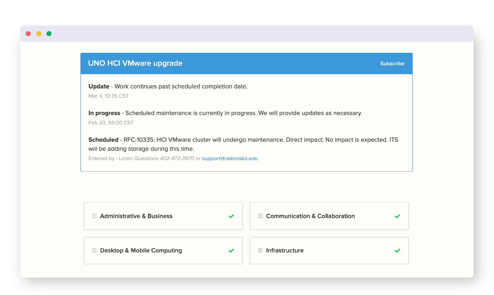
Who it’s for: The University of Nebraska is one of the largest state schools in the country. The school has 50,000 students and 20,000 employees. This makes for a large, varying audience of students, administrators, educators, and parents who would visit this status page in the event of an outage.
What we love: Clarity and brevity say it all. University of Nebraska’s page clearly displays the status of both scheduled downtime and the operational status of various systems with simple communications throughout.
800.com
System Status Page: Here
Industry: Software as a Service (SaaS) for B2B
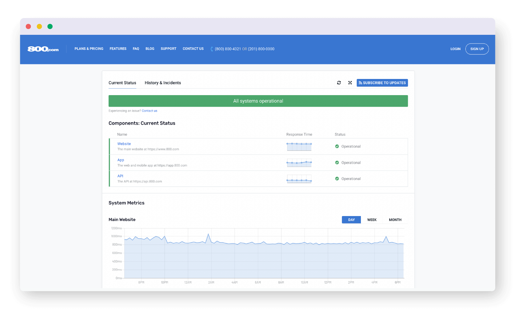
Who it’s for: 800.com services a wide variety of businesses in various industries, so their status page should be equally-comprehensible to all. The nature of 800.com’s business means their customers will be quite sensitive and aware of whether systems are operational.
What we love: 800.com’s visual representation of uptime allows users to quickly infer overall system status while also digging deeper into detailed system metrics. In all, this makes for a comprehensive status page.
Like what you’ve seen? Uptime.com has the tools to help you easily the kind of custom branded status pages you’ll want seen and subscribed to.
Learn more about our public and private status pages here – and try us 100% free for 14-days with a website monitoring free trial.
Minute-by-minute Uptime checks.
Start your 14-day free trial with no credit card required at Uptime.com.
 Uptime.com Blog

