Website Uptime Monitoring Dashboards | The SRE’s Ultimate Multi-Tool
It’s 3 AM and you are roused out of sleep by the dull buzzing of your phone in the other room. Some sort of emergency, you conclude as you fumble with the lockscreen.
There it is: an alert that the API governing user registration is acting up. Right around the time you sigh and think about a cuppa, you realize the clock has been ticking and you have a job to do.
When we think about the lag between time of incident and time to respond, it’s not just about how long the system went down. How long it physically takes us to respond to the problem also contributes to lost downtime.
When we have instant access to technical information, our response time improves and our overall uptime percentage remains higher than if we were caught flat-footed.
Uptime.com created a customizable dashboard system that brings that level of personalization to you and your organization.
What is a Website Monitoring Dashboard?
Web monitoring dashboards from Uptime.com involve three components:
- Metric Summary: A bar at the top that includes the metrics that matter most to you. At a glance, learn the state of your checks, your most recent outage, your cumulative response time, and when your last alert was issued.
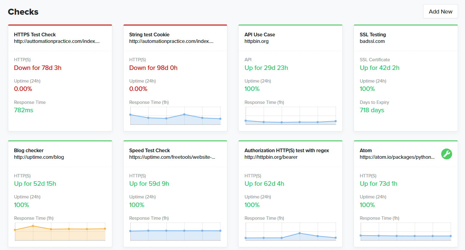
- Check Cards: The meat of the dashboard consists of Check cards with response time graphs and 24 hour uptime expressed as a percentage.
- Alert History: A log of recent alerts that display only what you want to see. Customizing this space will help you determine where your attention is needed most.
Today, we’ll walk you through customizing the look and feel, ignoring alerts, making your most important check cards front and center, and other important functions. Whatever your priority, our robust Dashboard is ready for you.
Customizing Uptime.com Web Monitoring Dashboards
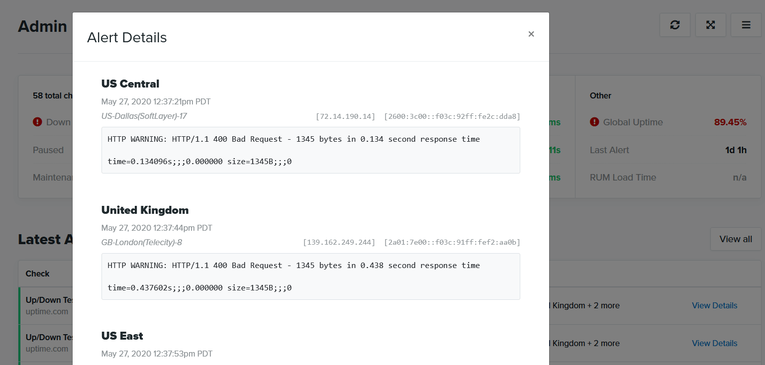
It is now 3:05, the PC is booted and we are ready to go. First, we will need to review the alert for any technical details we can glean. We might want to know, for example, what other URLs are experiencing outages and whether our registration process is still intact.
We might then focus on other downtime alerts we observed for the period. Can we identify any trends in the downtime? Do any of these incidents show spikes in response time signalling an imminent outage?
With Uptime.com dashboards, we have rapid access to these technical details:
- Chronological alerts are accessible
- Irrelevant checks and data are filtered
- Rapid access to key performance reports and outage data
You locate the down check, review the alert, then you can click into the check for performance reporting or review.
With these three needs met we can focus on response. We are agile enough to react to fires, with the observability we need to notice outages as or even before they occur.
Creating a Check Card Wall for Visibility
Before our 3AM fire ever started, we decided to create Dashboard 1: our wall of check cards. The goal was to create a web monitoring dashboard that included our most important monitors, which we displayed on a vertically rotated television monitor front and center in our office. We nicknamed it “The TARDIS” and it is the command post of our IT department.
We exterminated the Metric Summary and Latest Alerts sections to achieve this goal.
Since this dash is accessible to everyone on our team, we all have visibility in office and that makes it easy to delegate when a fire breaks out:
This is our default dashboard and the first one I will encounter when I log into Uptime.com. If you follow this guide and use our ideas for your own, you can quickly switch between each of these boards for the view you need when you need it.

Controlling Metrics and Filtering the Noise
I need access to alert data quickly in this instance. I don’t really care about check cards, but it would be great to know how many outages I have without digging around for it.
Let’s first dive into the Metric Summary tab, where I can control visibility on all metrics. I’ll toggle global metrics off for any checks that I do not want this Dashboard to show me. I’ll maintain my card at the top that tells me my total checks, number of outages, and provides performance data but it will filter that data to the specific services I have designated.
Neat!
Now I know how my major services are performing, let’s make sure I’ve ticked the box to show my latest alerts:
The result puts that alert data pretty much front and center: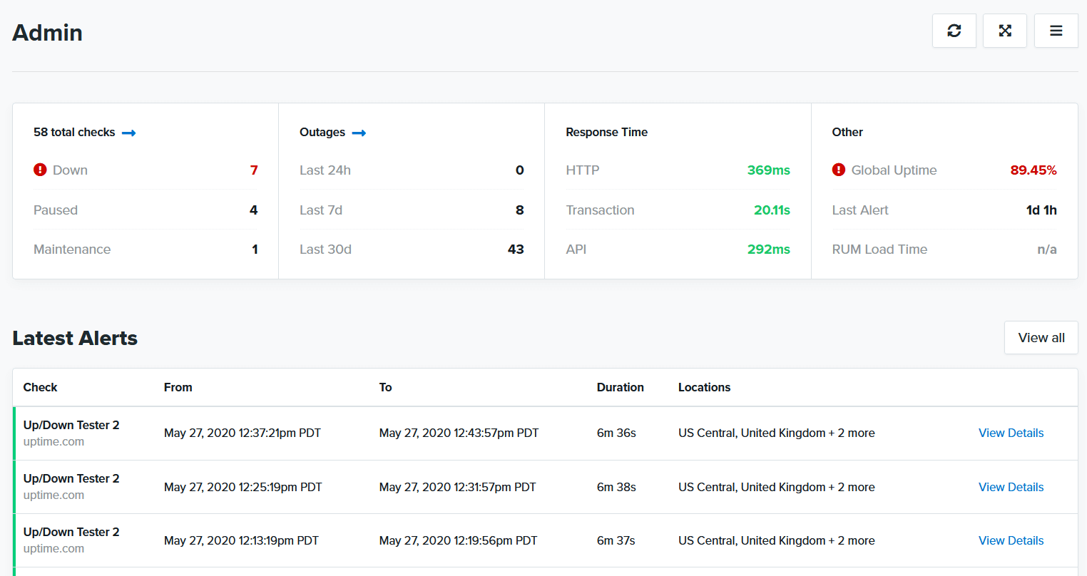
I can click View Details, and I can instantly review any alert I choose from the list:
Using this dashboard, I focus less on performance and more on the immediate task at hand: resolving the alert.
I can further filter those alerts to show only those related to the checks I’ve selected if I choose. But I like awareness of my account, and I’ve chosen only to filter alerts that I’ve ignored so I have control over what goes into this space.
Looking for a way to filter out the noise in your monitoring? Try Uptime.com today for free for 21 days, no credit card required.
Web Monitoring Dashboards to Improve Observability
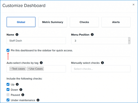
This final Dashboard will provide my staff and I quick access to the checks we need to focus on. If I need to call others in on this incident, I want them to be able to review what I am seeing and bring their own insights to the diagnosis.
I’ll use some of the same check settings I used to create my global wall so we’re all tracking the same priorities. I also want them to have access to some of the same metrics I rely on, alongside alert history so they know where their attention should be.
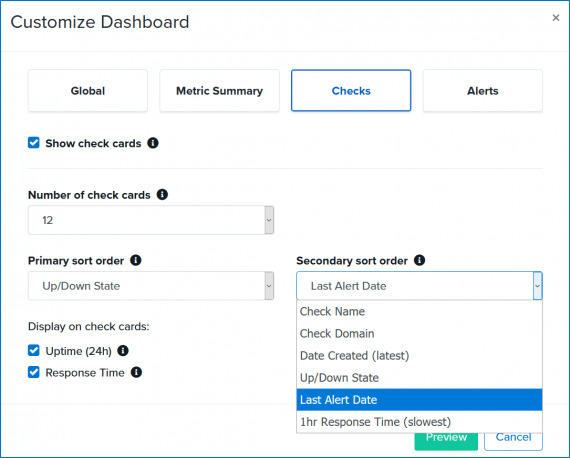
Let’s determine the logic for check card sorting first.
Click Checks and you’ll notice that we’ve set default values of Up/Down State as the primary and Last Alert Date as the secondary sort order. This order shows you recent outage cards at the top of the list with checks that have most recently issued an alert as the secondary sort value. You’re free to customize these as you see fit:
- Check Name
- Check Domain
- Date Created (latest)
- Up/Down State
- Last Alert Date
- 1hr Response Time (slowest)
Here are some use cases:
- 1hr Response Time//Check Domain: If you run a series of HTTP(S) checks for different domains, this setting will tell you which of these URLs is the slowest
- Last Alert Date//1hr Response Time: Provides a glimpse into which checks most recently had outages, and have reported high response times within the previous hour
- Up/Down State//1hr Response Time: This configuration allows you to view most recent outages, with checks reporting as UP sorted by response time within the previous hour.
Additionally, you can configure the number of check cards you see at once. By default, we allow four cards to show with auto-refresh functionality. Increase the number of check cards visible to improve visibility on the checks you need to see.
We will pin this dash to our sidebar, as it’s an important one we want easily accessible. You will notice once you’ve saved your work that clicking on Dashboard from the left-hand menu now features a list of dashboards we have pinned to this space.
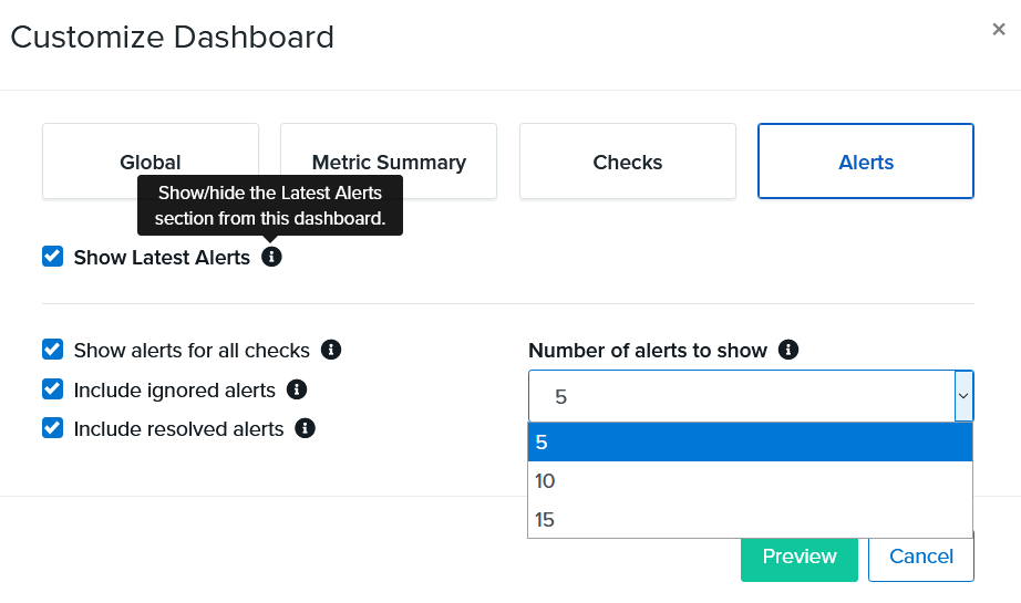
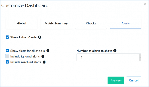
Latest Alerts
Choose how latest alerts are displayed, and whether ignored or resolved alerts appear on the dashboard. You can also change the number of alerts visible to a maximum of 15.
Devising Your Web Monitoring Dashboard Strategy
Our needs at 9 AM or 2 PM are very different from our needs at 3 AM. We need a flexible system that puts metrics front and center, but adaptable enough that we can use it for every time of the day. Bonus points if we can switch between them as needed. With Uptime.com customizable web monitoring dashboards, you gain observability over your entire system.
Your ability to create more than one Dashboard depends on your account tier. Accounts above Basic have access to multiple Dashboards. Check your account’s account usage to see your options.
To save a dashboard, first click Preview and ensure everything is configured to your preference. Click the Save Disk icon to save the changes.
Some Last Minute Notes
As always the customization options we’ve discussed above are available through the Uptime.com REST API
One quick note on tags, as they are a useful feature we don’t often discuss. An account that utilizes tags benefits in multiple ways:
- It’s easier to create and manage Dashboards and Status Pages
- Filtering checks from your Checks screen is simplified
- Search for specific checks you need much faster
- Efficiently manage multiple teams or groups of checks
Dashboards (and Status Pages) reward this curation with reporting that puts the statistics you need right at your fingertips.
If you prefer one dashboard over another, you can set its menu position as “1” to make it the first item to appear. Additionally, you can tick the box Pin this Dashboard so that it appears in the left side menu. This feature is best utilized by owners and administrators, who should be the ones to set the defaults on the account.
Happy monitoring!
Minute-by-minute Uptime checks.
Start your 14-day free trial with no credit card required at Uptime.com.